

Loading all the things. Thank you for your patience.

Loading all the things. Thank you for your patience.
“I never properly
learned typography,
I just draw letters
for my posters.”
“I never properly
learned typography,
I just draw letters
for my posters.”
Swiss poster artist Otto Baumberger
GT Walsheim is inspired by the poster lettering of Otto Baumberger (1889–1961). He was a Swiss painter, stage designer, lithographer, and poster artist who created over 200 posters during his career. This website introduces the refreshed GT Walsheim typeface family and highlights Baumberger’s beautiful poster designs.
You can tap on most images to reveal sketches, animations, and more.
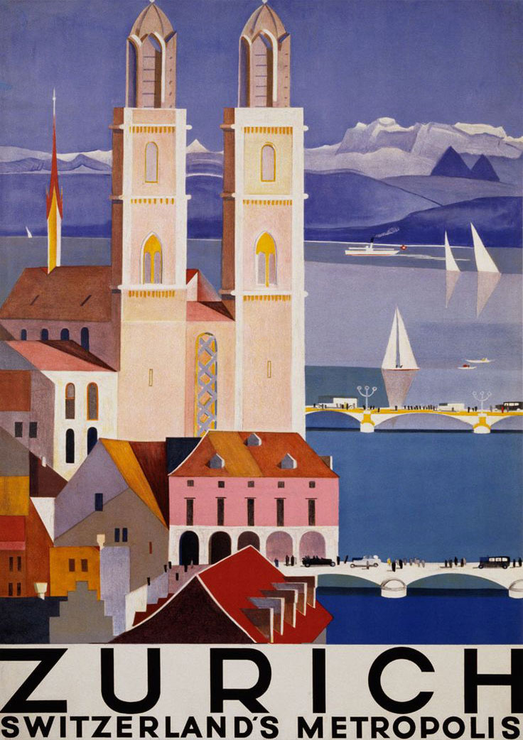
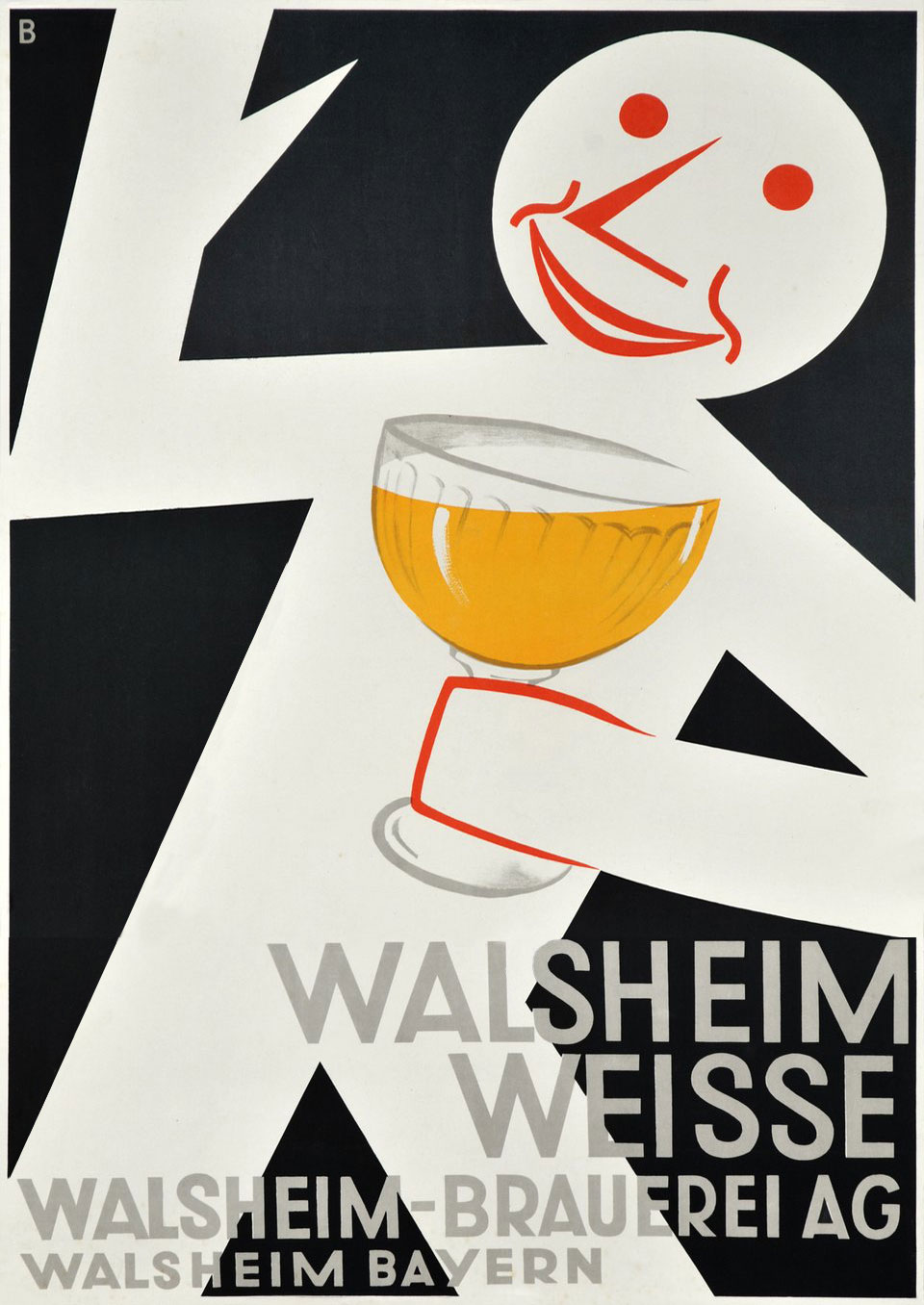

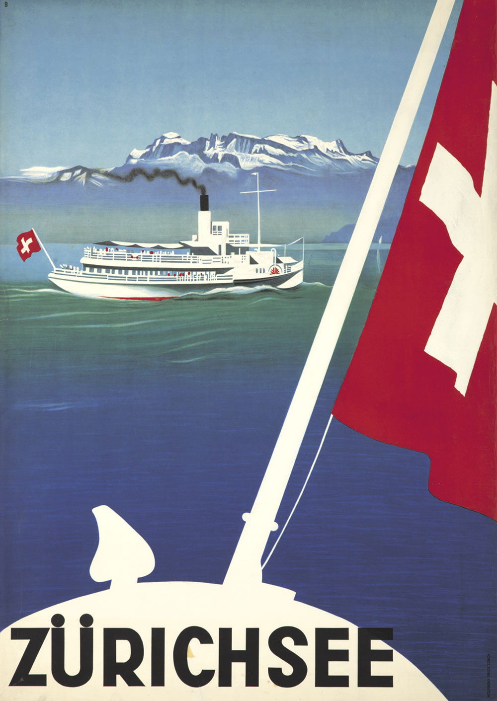
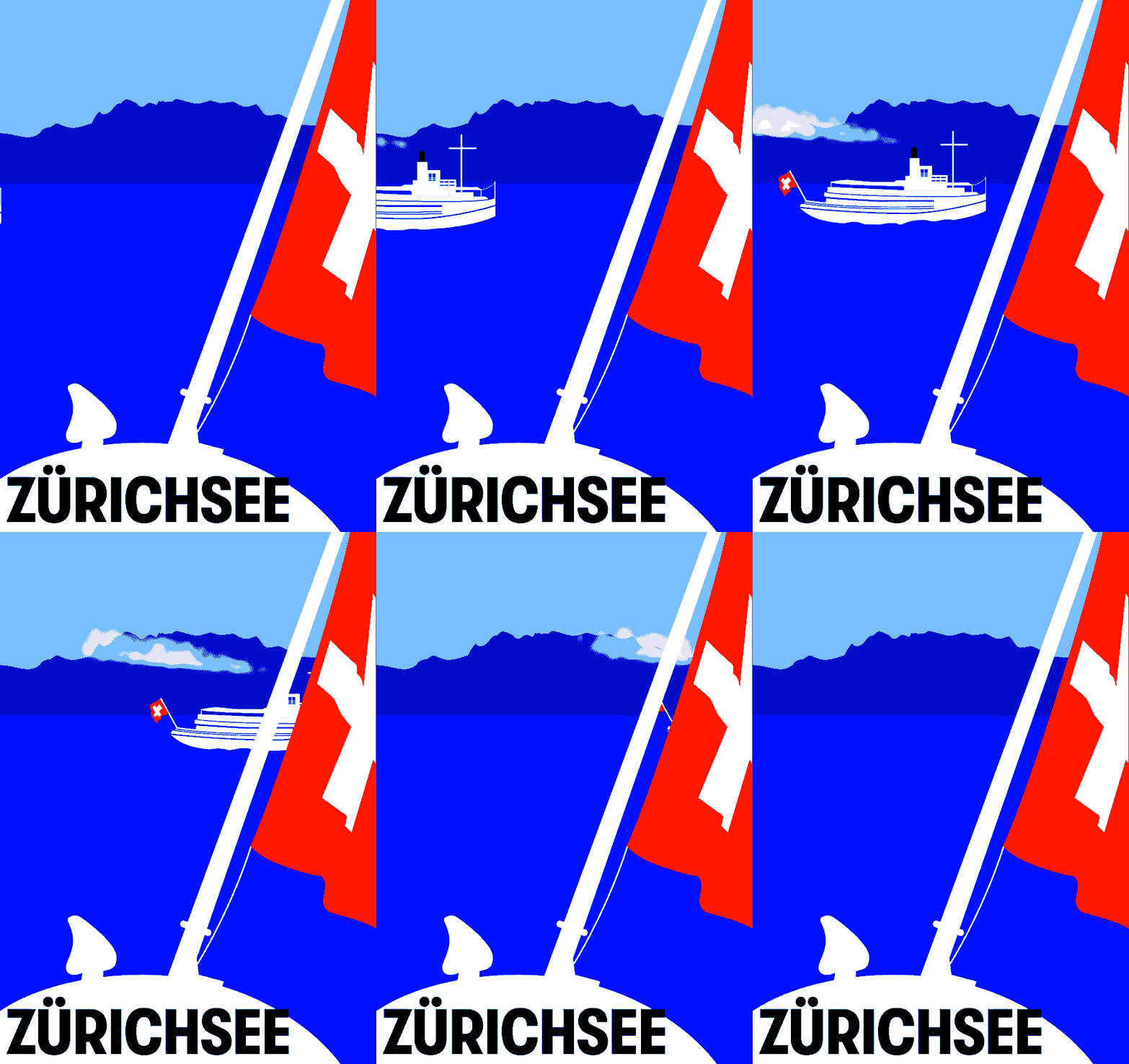
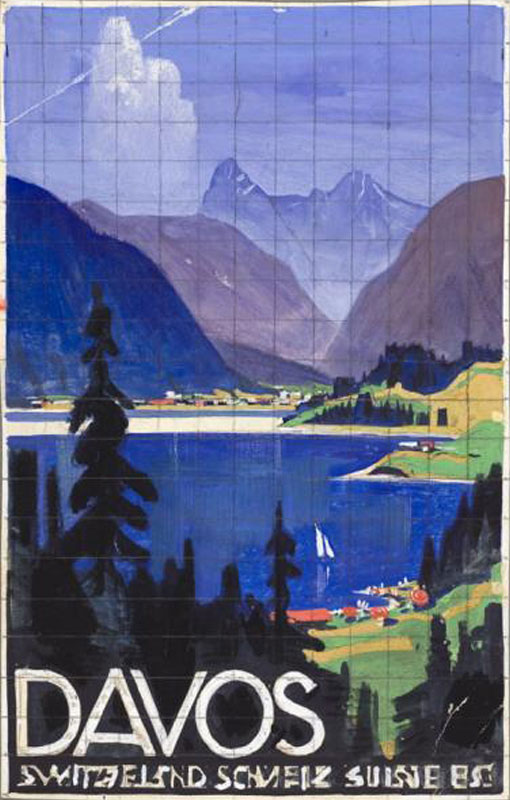
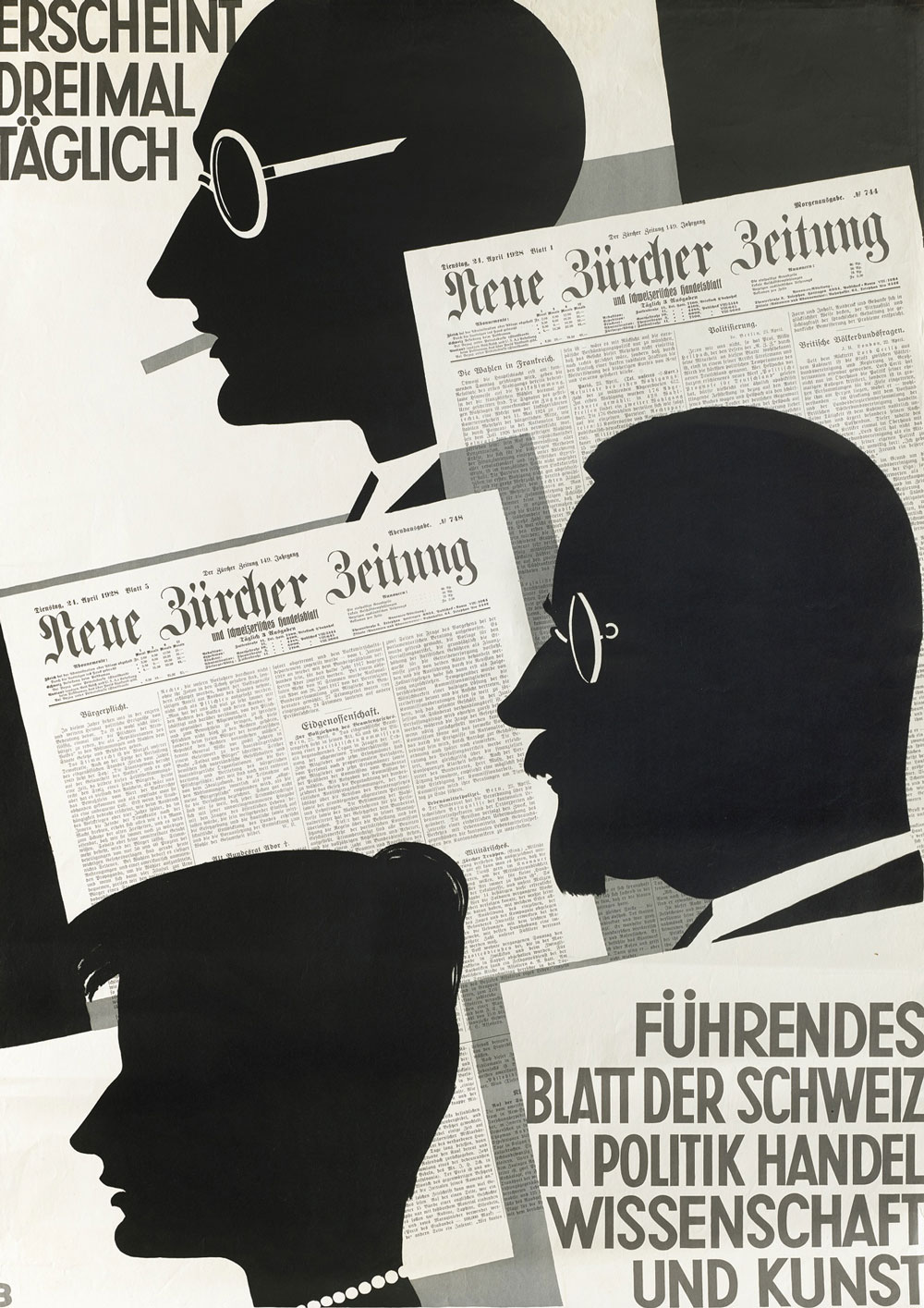
His work is fascinating for many reasons. Like most designers of his time, Baumberger created a lot of tourism posters with the Swiss Alps in the starring role. His career was marked by the ascendancy of branding and consumer products in society.
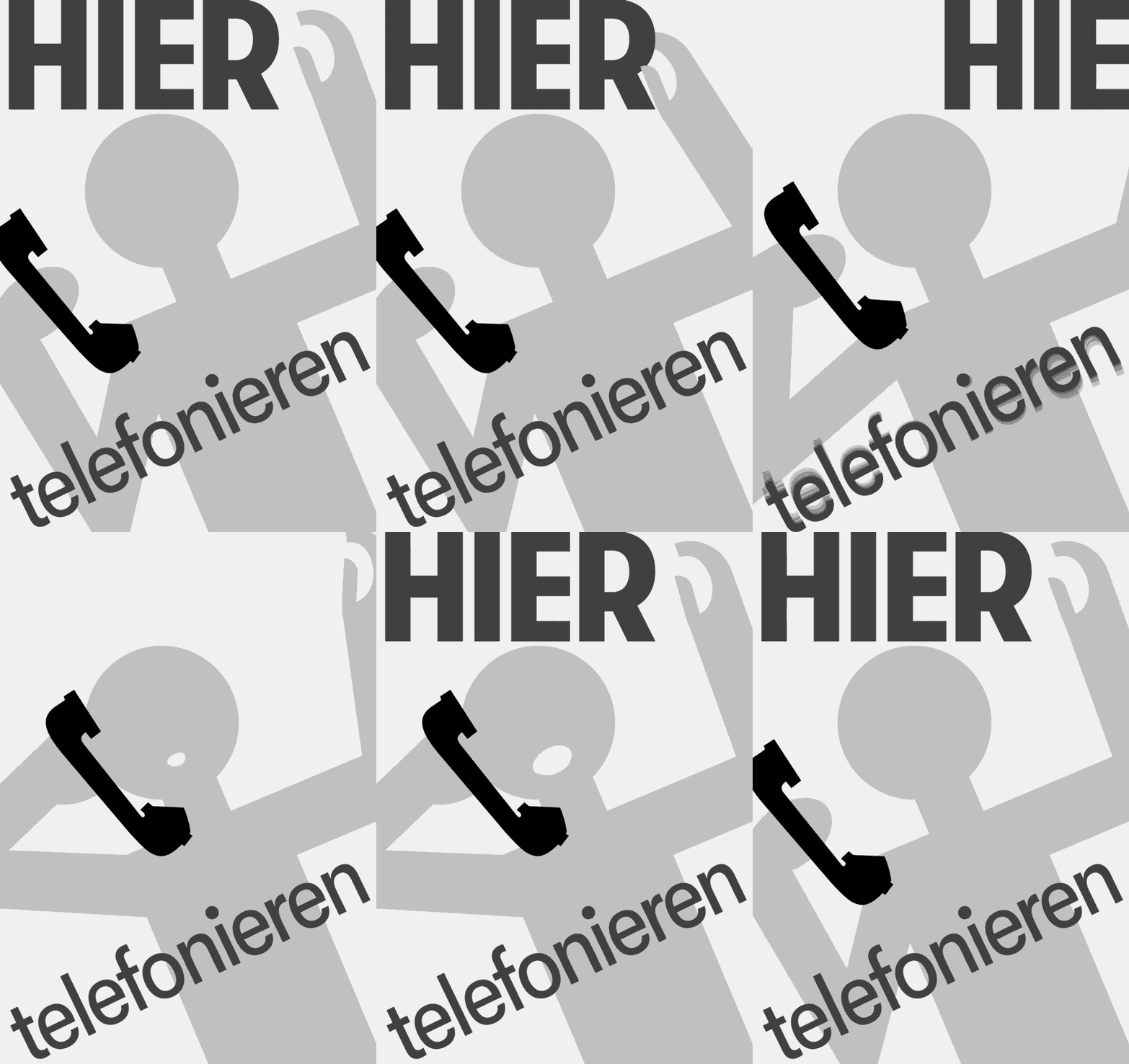
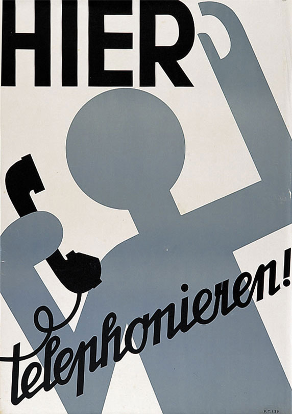
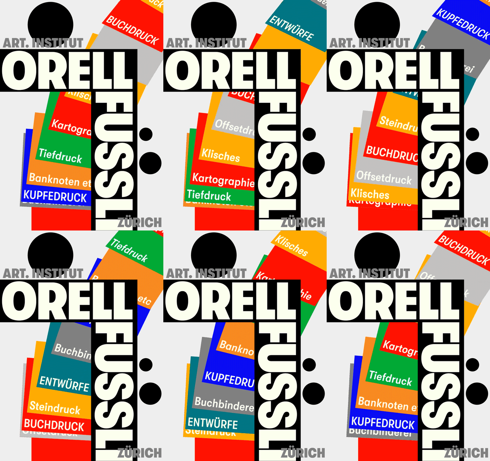
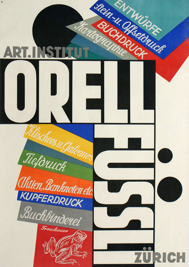
At times Baumberger’s work leaves the aesthetics of landscape painting behind for a more abstract, geometric look that was so characteristic of the later Swiss Style. All those posters have in common that they allow Baumberger’s geometric lettering to take center stage.

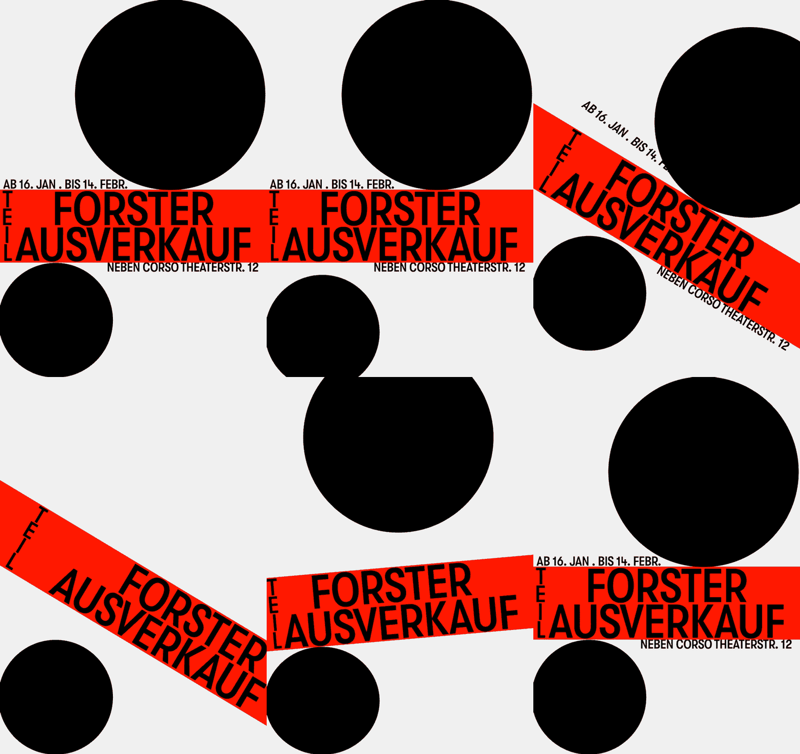
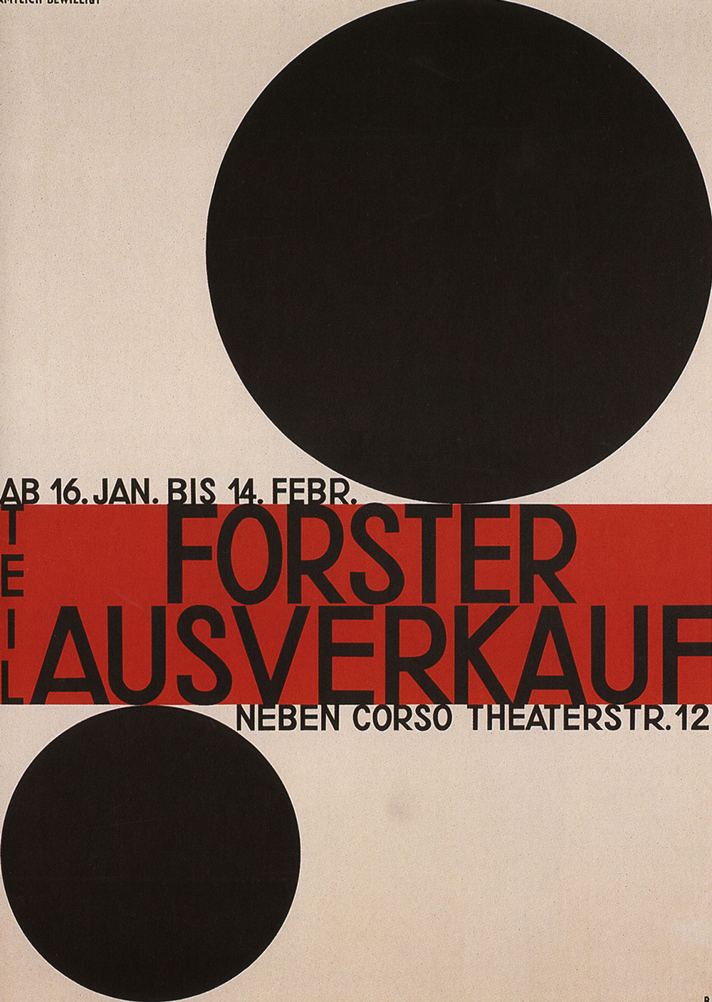

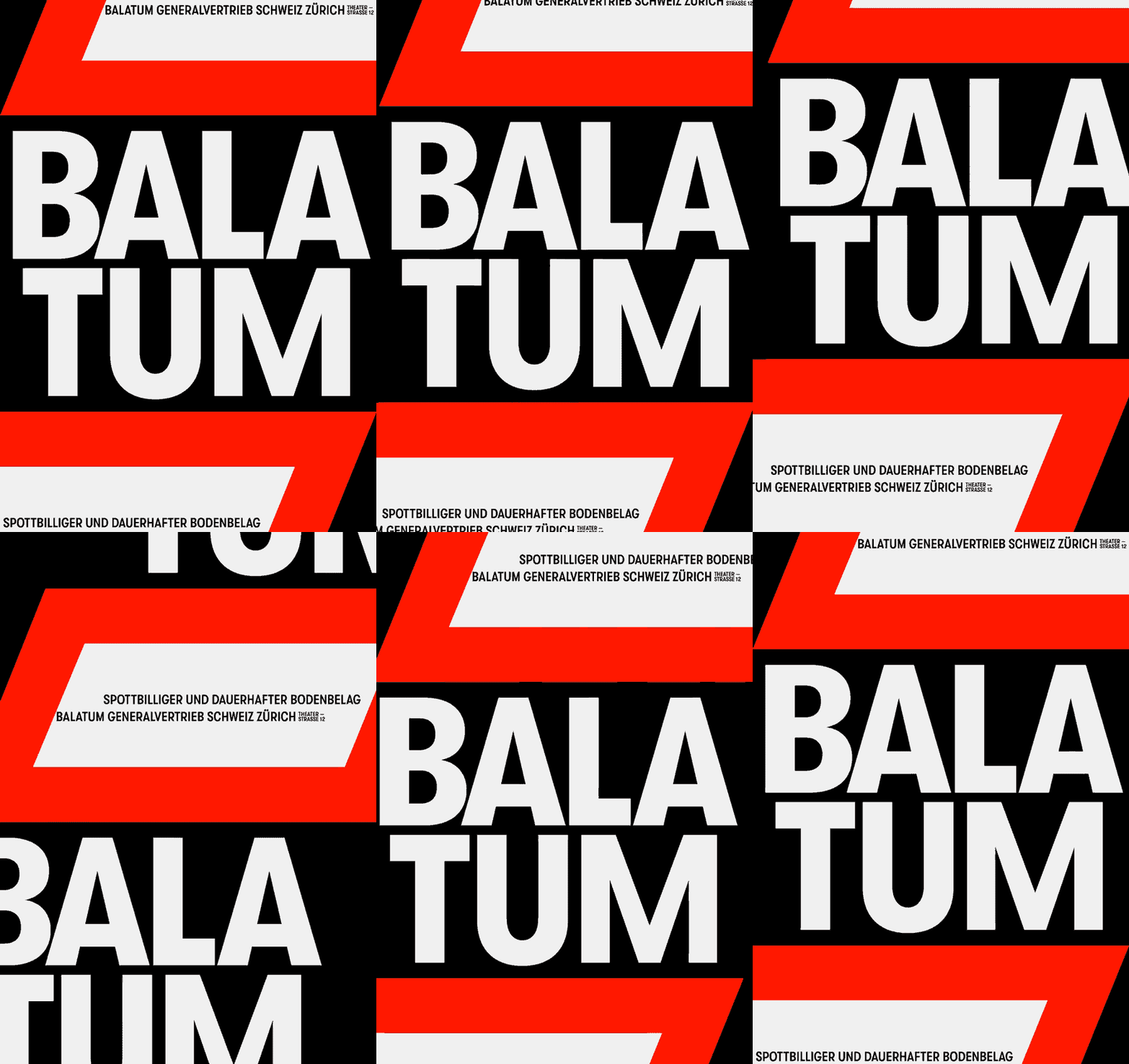
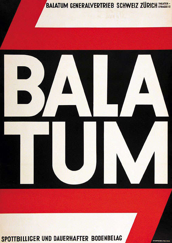

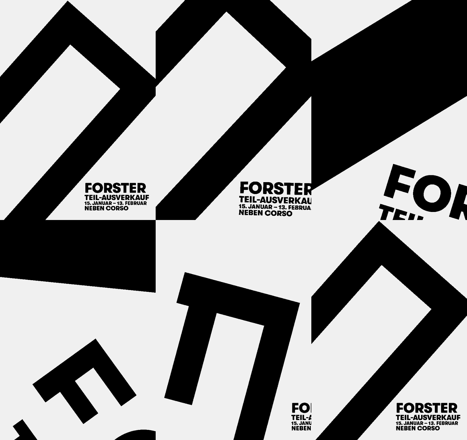
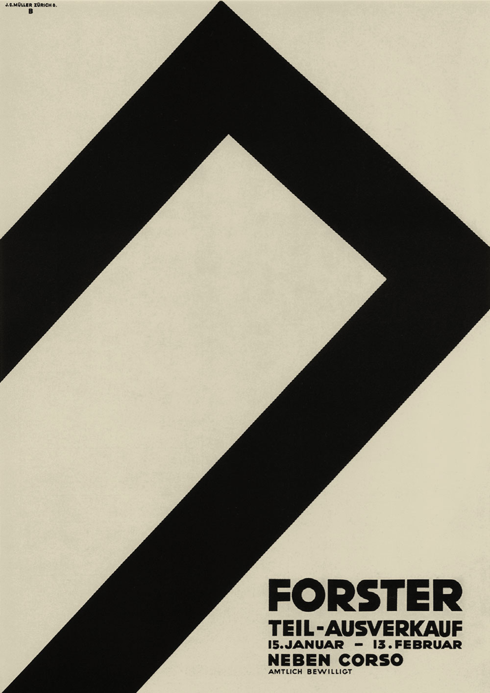

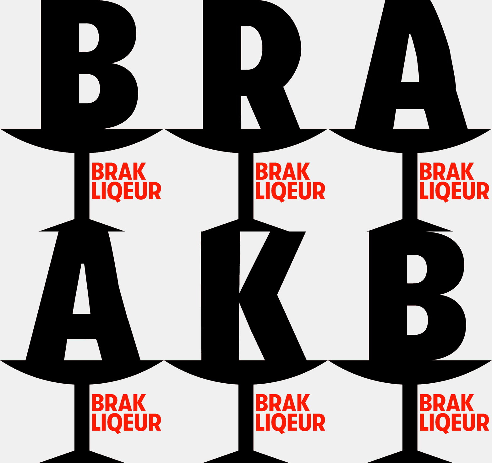
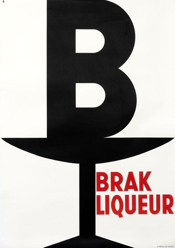
One of the most important Swiss poster designers of the first half of the 20th century, Baumberger created those works before it would have been called design: He was a poster artist. His work exemplifies the movement from painterly to abstract designs during this time: Swiss Style before that term even existed.
But Baumberger did not only create tourism posters. As an employee of the J.E. Wolfensberger printing shop he designed for a large variety of clients. This includes some posters with racist and sexist visuals that are deeply offensive. Even a close reading of the available biographies doesn’t reveal Baumberger’s political leanings, but we still find it important to qualify his work. As we don’t believe sharing these posters in this promotional context would be appropriate, we will not reproduce them here.
Baumberger’s eye for type was what captured our interest in his posters. As lithography posters were drawn by hand, his type was always lettered by hand as well. But he saw himself more as an artist then as a lettering expert.
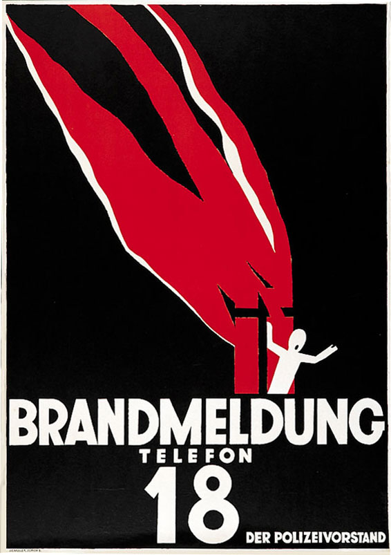
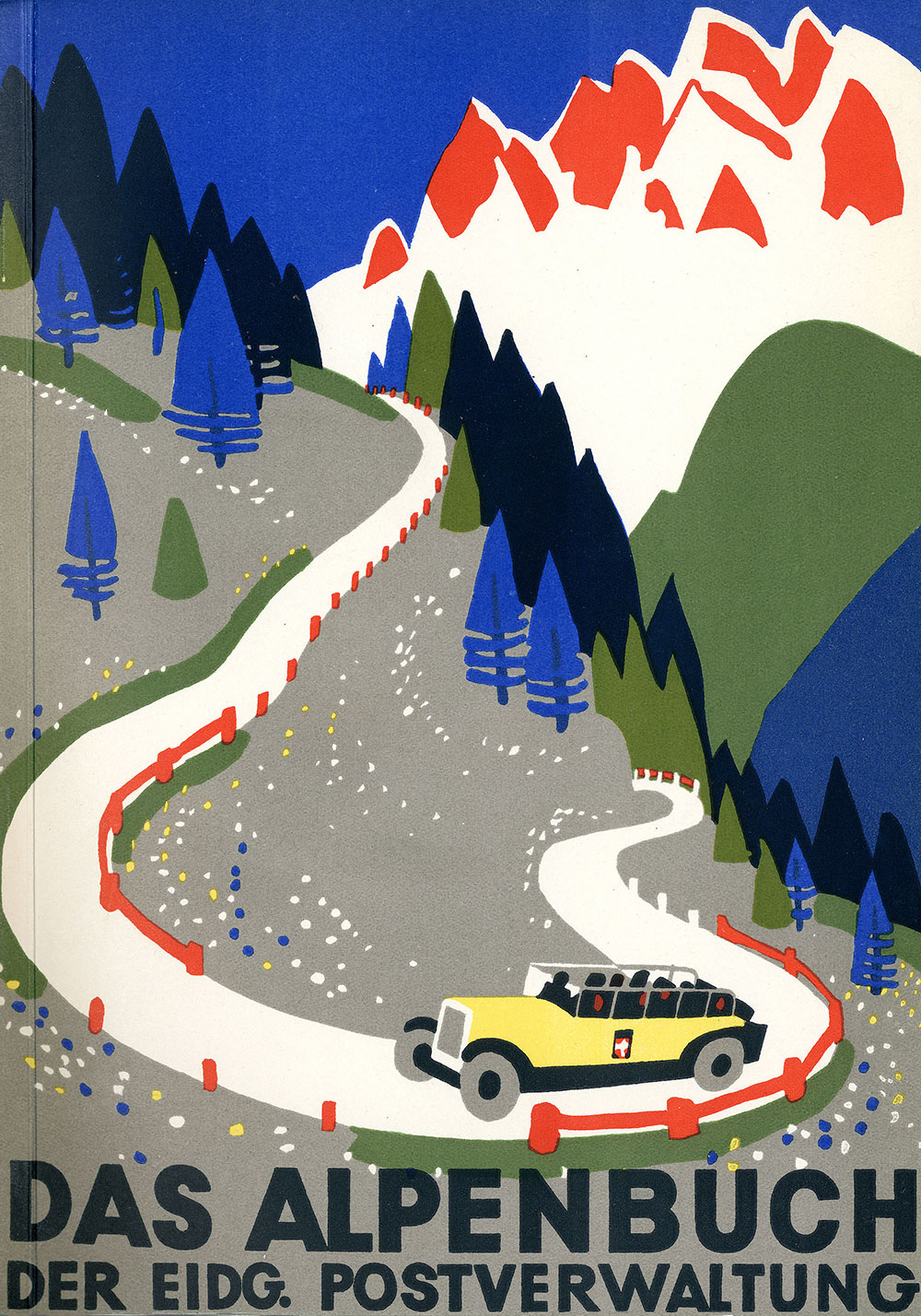
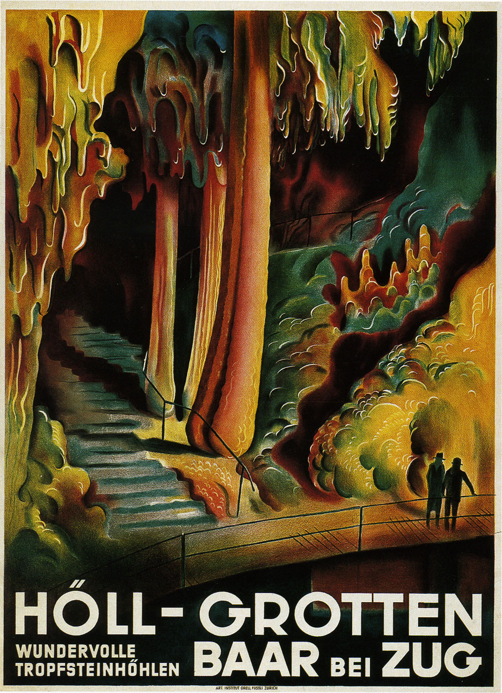
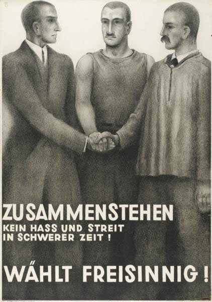
His work throughout the years used only a small number of lettering styles. In his geometric sans serif style, the capital G with its unorthodox construction – the Baumberger G as we call it – is one of the most idiosyncratic aspects of his work. This characteristic G can be found in many of his posters. The spacious R, the narrow A and L, and the large tittles (the dots on i, j, etc) are other distinguishing aspects of his geometric lettering style.
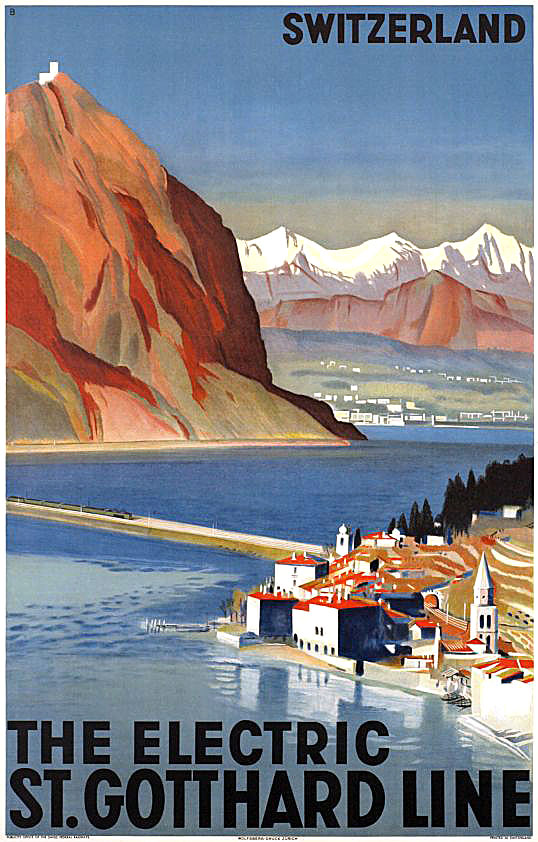
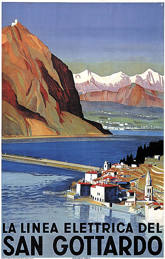
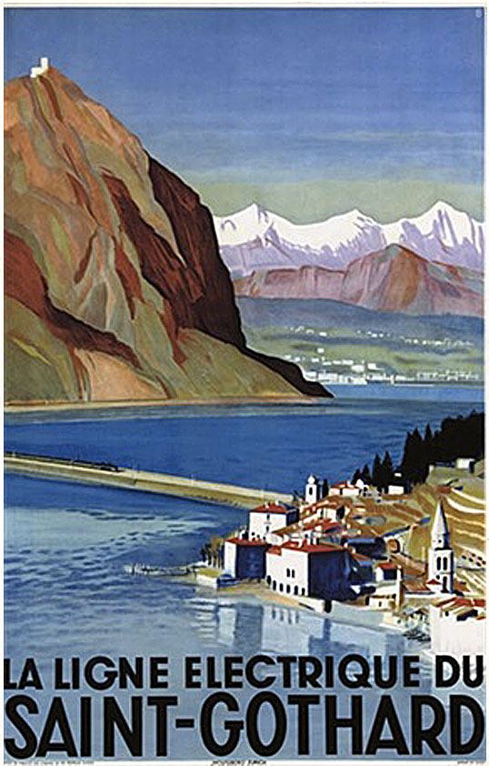
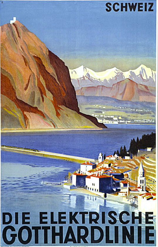
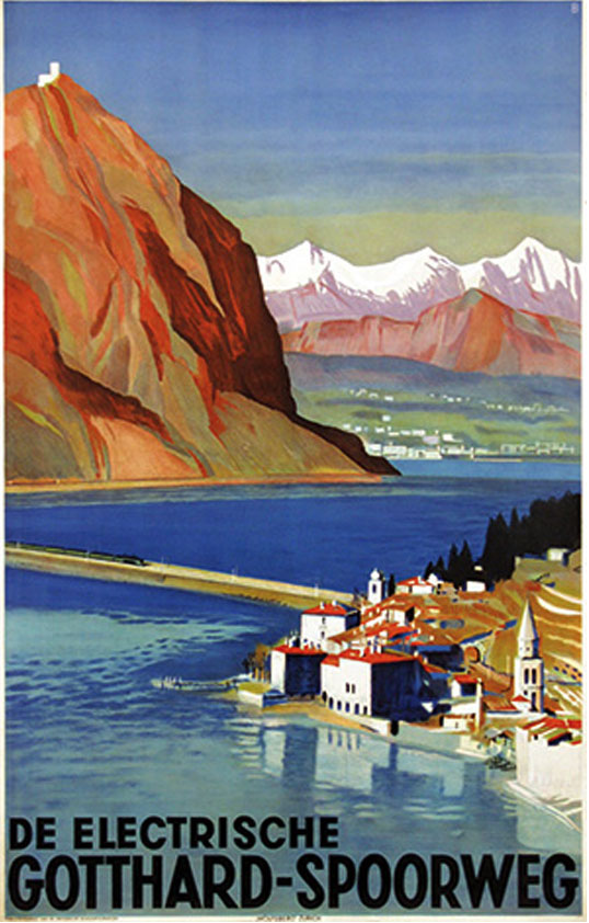
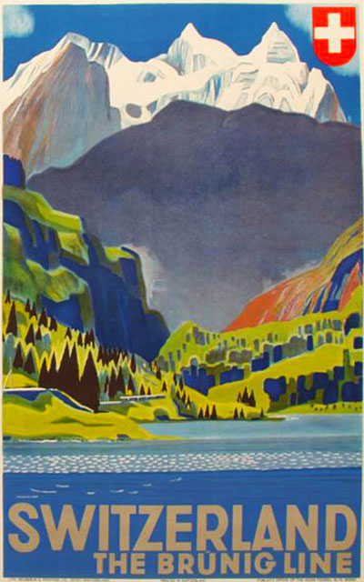
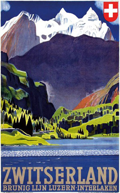
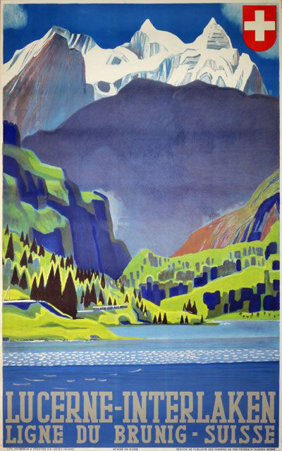
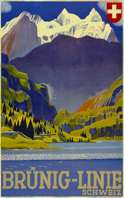
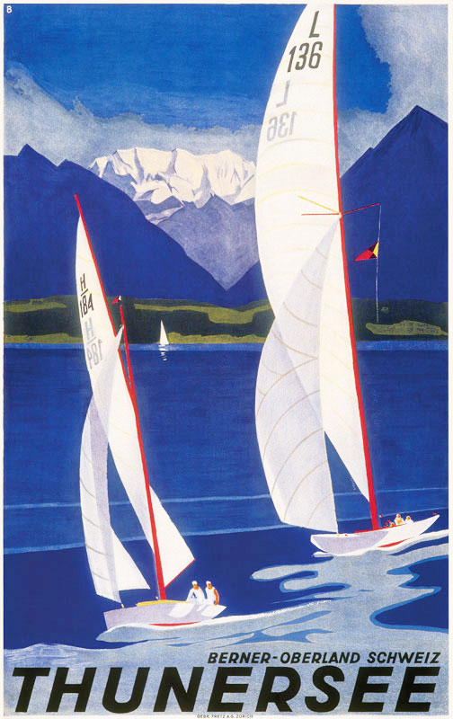
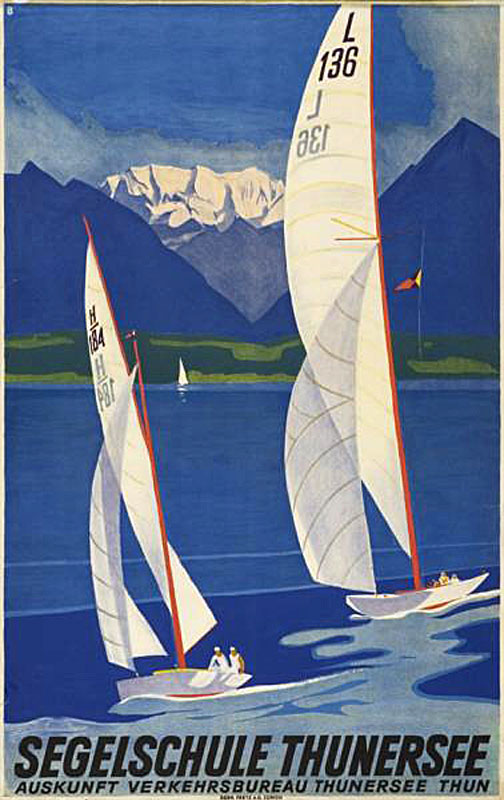
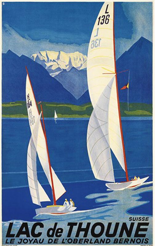
GT Walsheim’s origins date back to 2009. Its designer, Noël Leu, wanted to learn more about typography and type design while studying visual communication at the University of the Arts Bern in Switzerland. He was immediately drawn to how contemporary a lot of his work still feels. He was especially taken by Baumberger’s very charming geometric lettering.
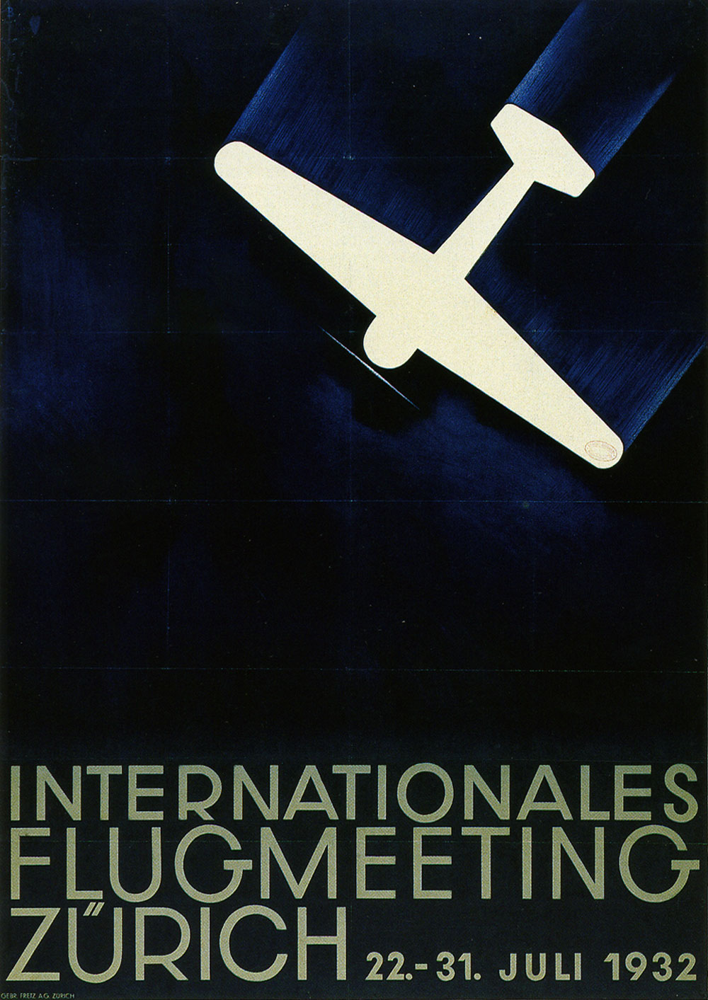
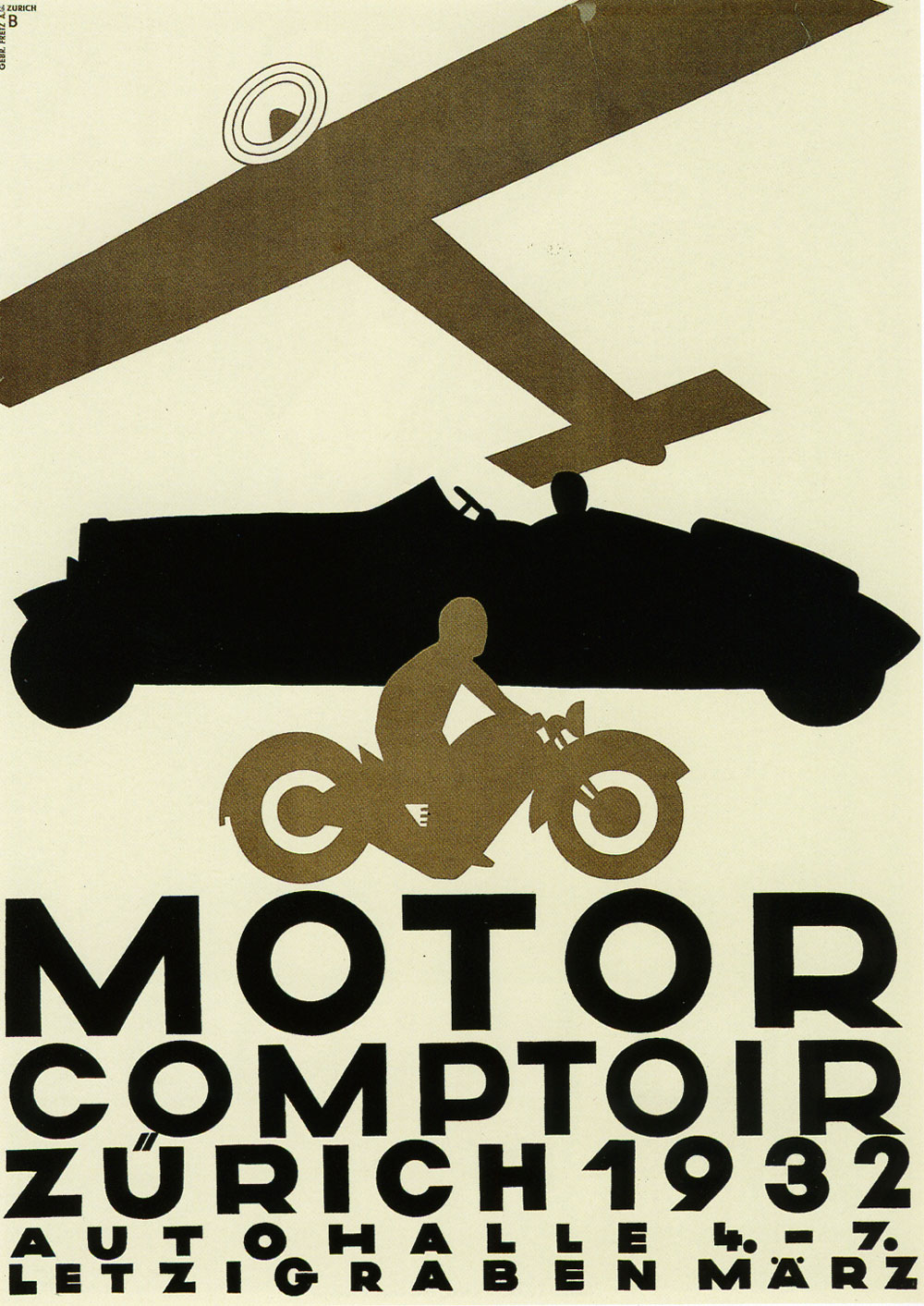
While learning more about Baumberger’s posters, he started to think about transporting that design vocabulary into the 21st century by creating a typeface. This resulted in the creation of GT Walsheim. Nearly a century after the original designs, Baumberger’s letters are now available as a typeface and have found their place in contemporary graphic design.
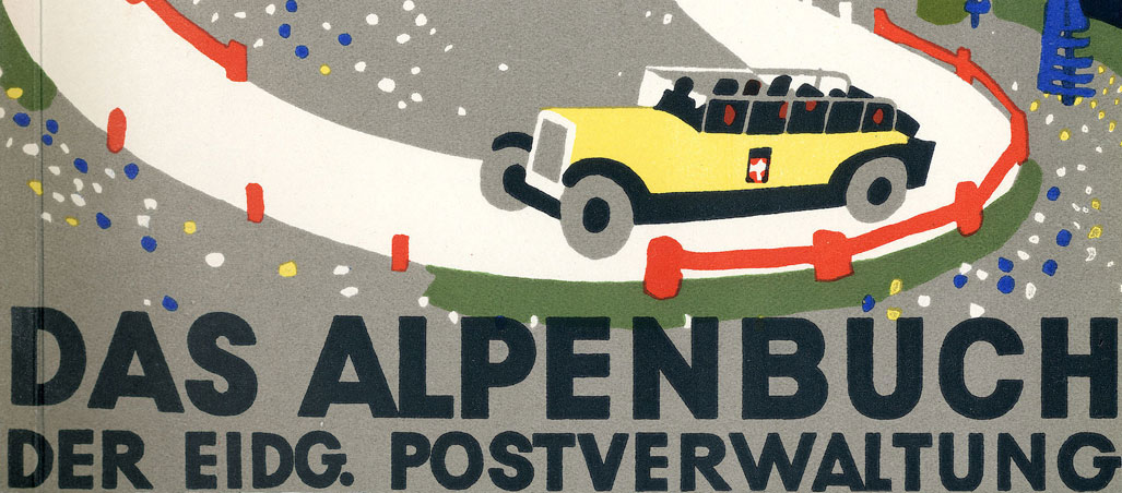
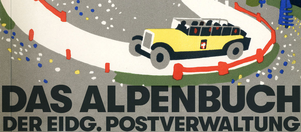
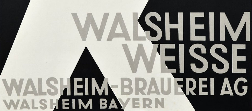
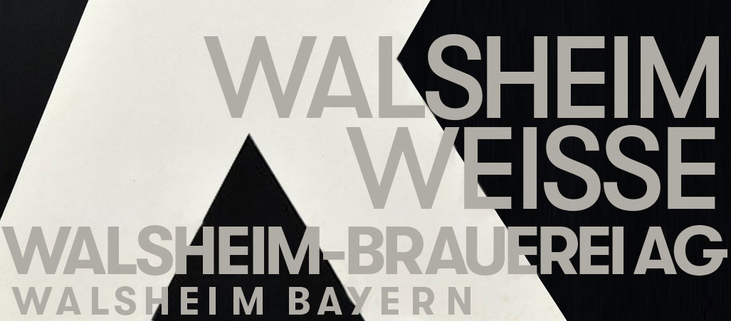
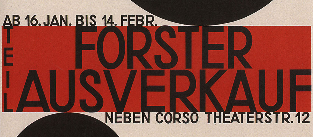
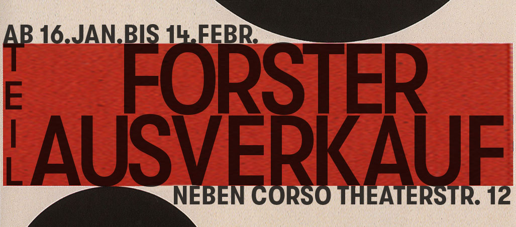
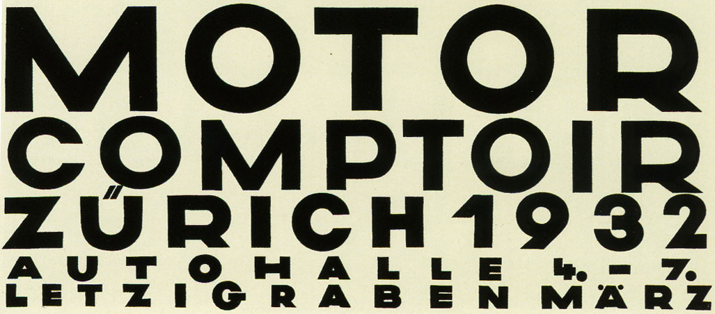
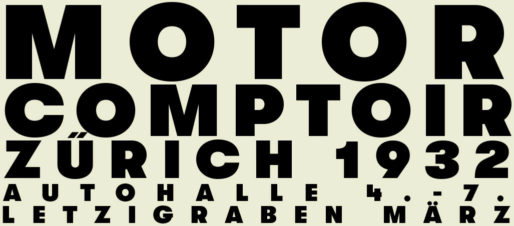
Noël began collecting versions of the capital letters from different posters and analyzed their design. It was important to him to understand Baumberger’s intention behind the designs instead of simply tracing outlines.
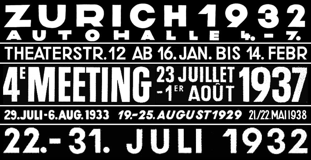
In a second step, he drew the numbers, which he at first strongly based on the posters he found. Soon he started drawing them more freely, though, to allow for a more curvy and friendly look while not losing the constructed, geometric skeleton.
The original posters barely contain any lowercase letters. True to Baumberger’s lack of typographic education, whenever they appear, they have very little to do with his capital letter designs. Following that realization, Noël instead created his own design logic.


The counter sizing of P and R are the basis for the x-height. This structure also defined other circular elements of the lowercase. The oversized tittles on letters like i and j mirror the large umlauts found on Baumberger’s posters. This gives the typeface a warm and friendly tone, similar to the proportions of a child’s face, that counterbalances the typeface’s geometric nature.
Baumberger
Producing posters wasn’t always as easy as it is today. In Baumberger’s days, the poster printing technology of choice was stone lithography. The design had to be transferred onto printing stones. Multiple stones were used to produce multi-color posters.
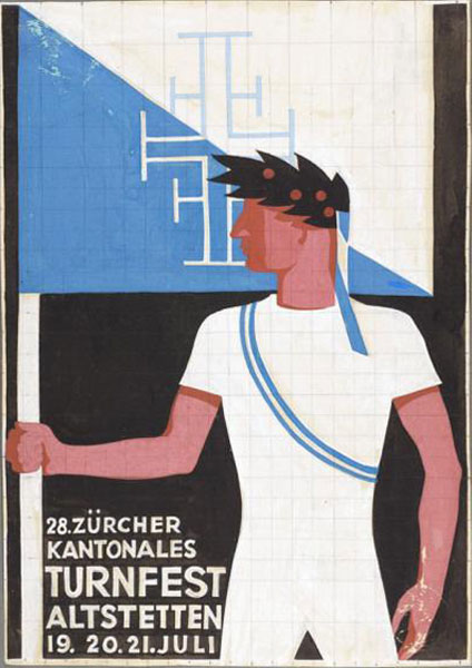
Baumberger often sketched his posters with gouache in postcard-size or even smaller. He then drew a grid over the sketch to simplify the transfer onto the much larger final format.
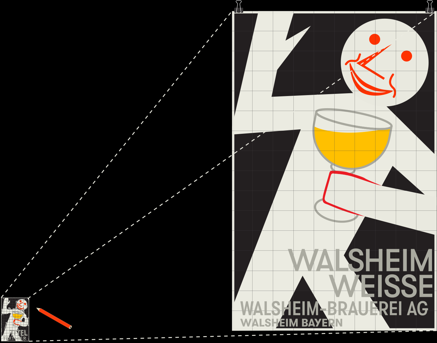
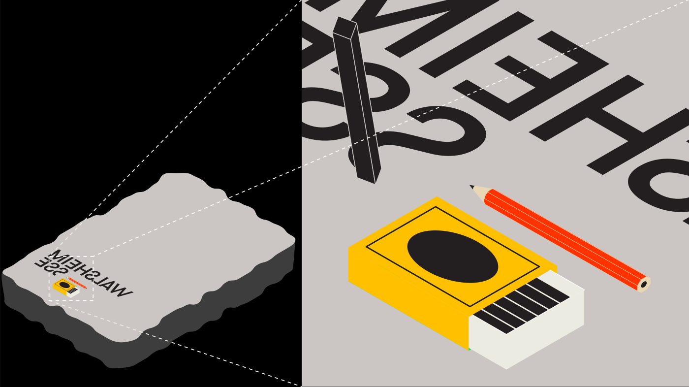
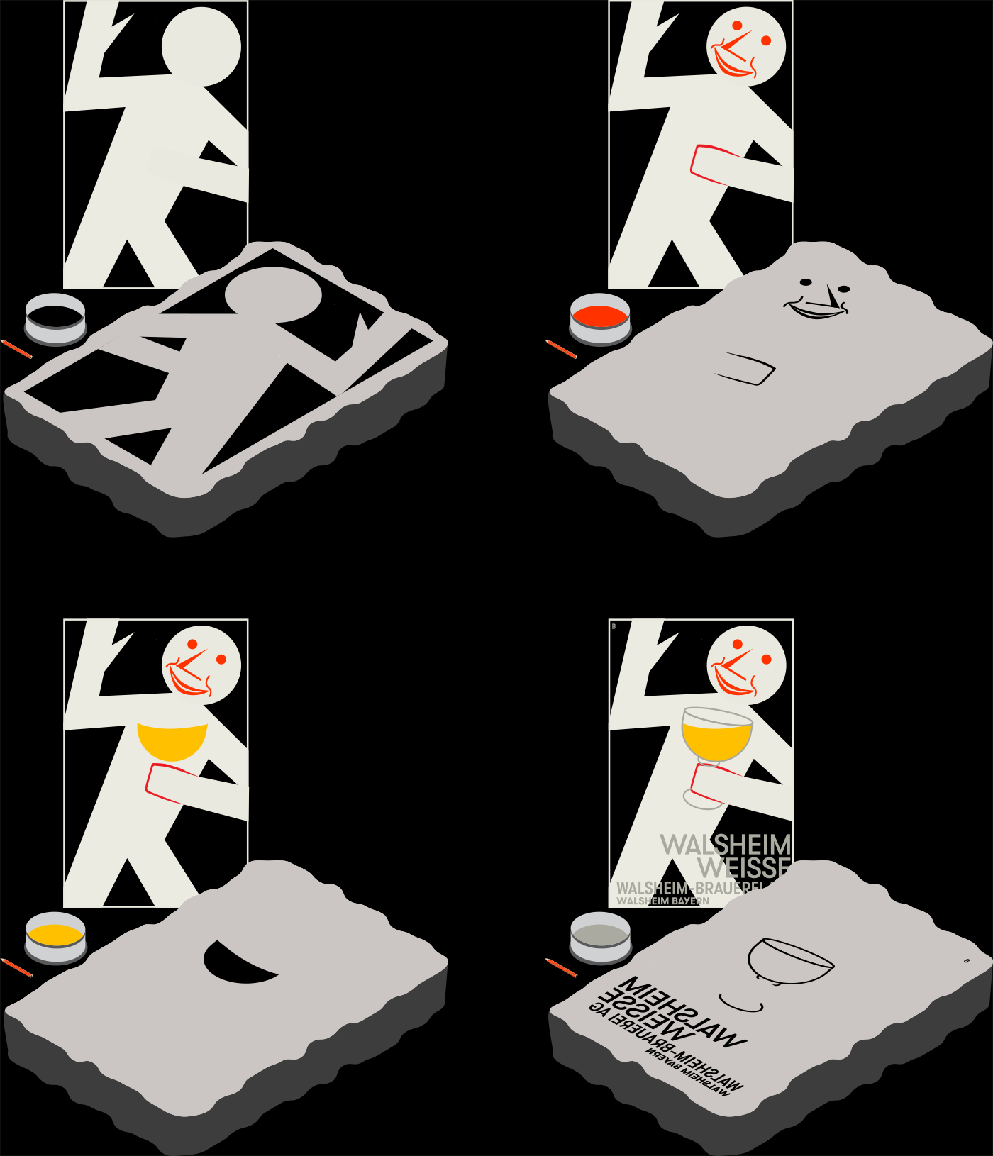
During a visit to the poster collection at the Museum of Design, Zürich, we were fortunate enough to be able to have a look at original sketches and posters ourselves.
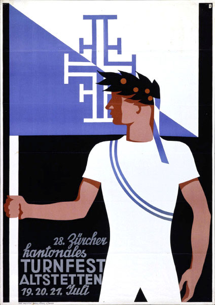
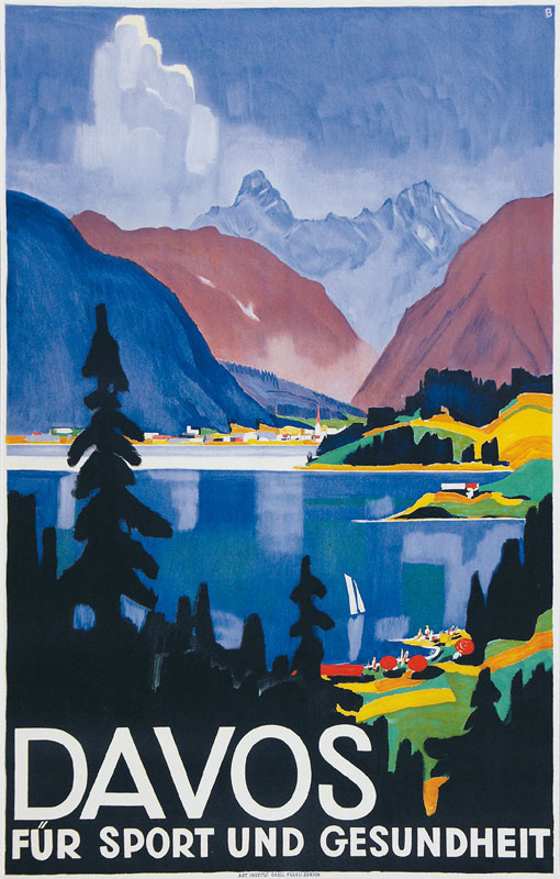
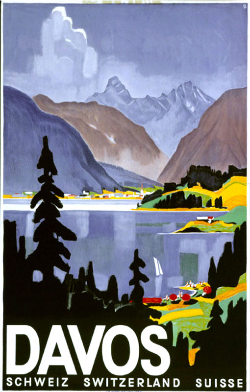
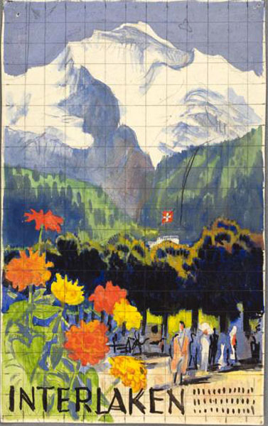
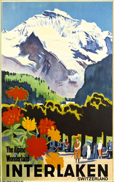
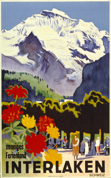
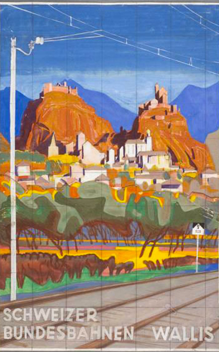
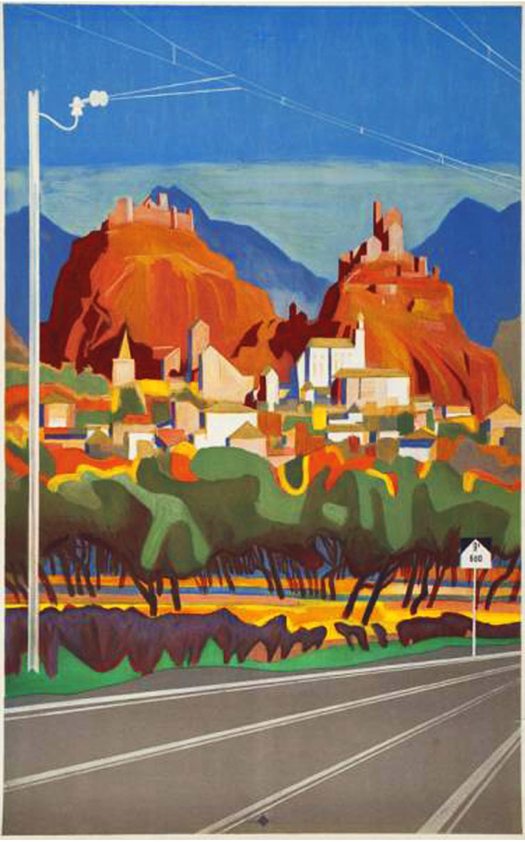
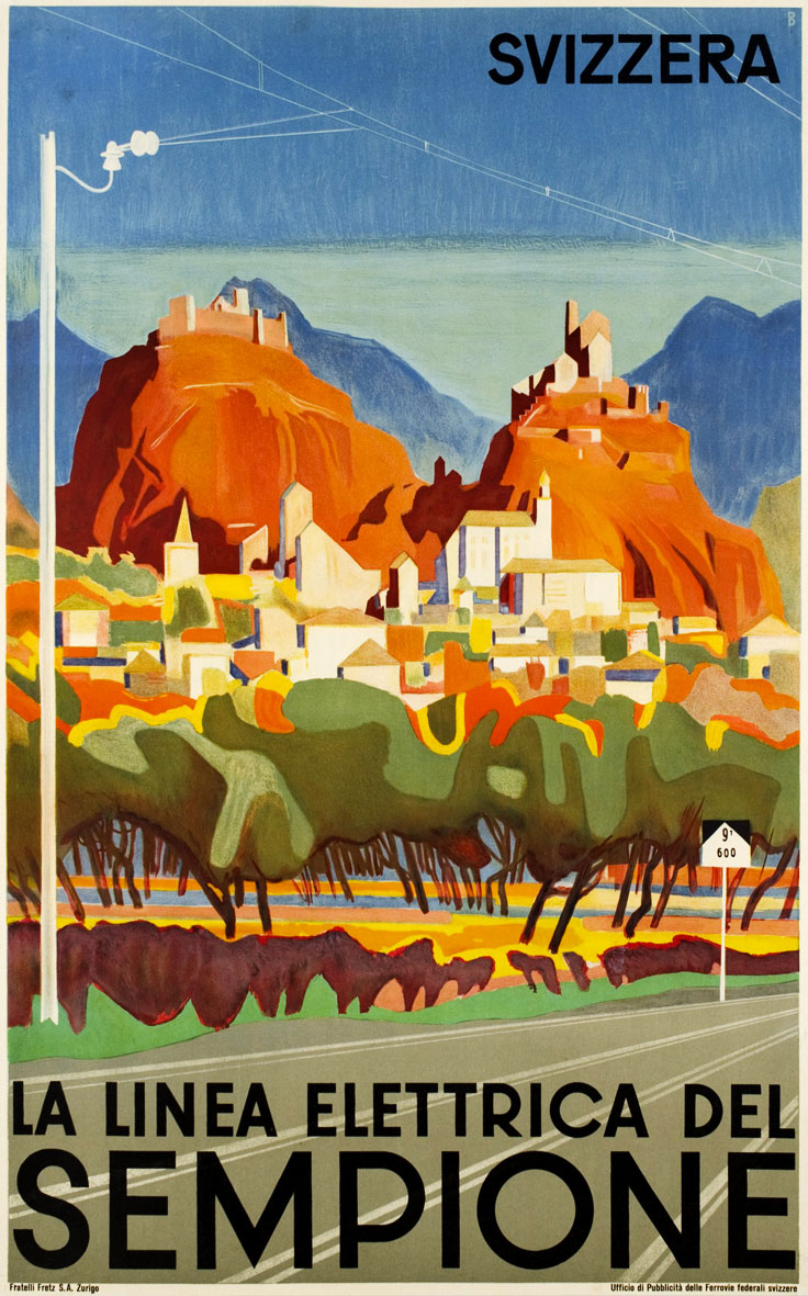
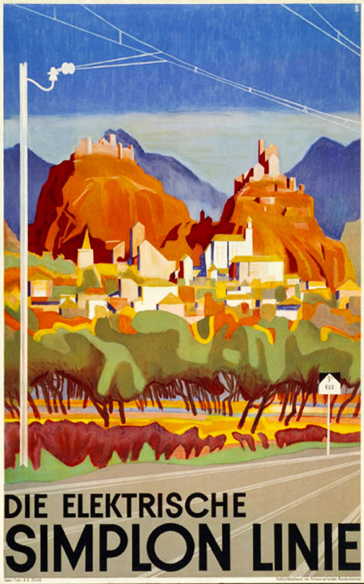
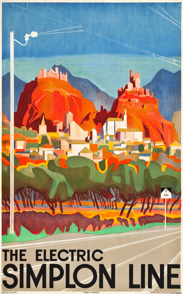
A number of Baumberger posters that we originally collected show a condensed variant of his geometric lettering. Narrow letters take up less horizontal space and can be displayed at a larger size without taking up too much space. This makes condensed letters very useful for poster design.

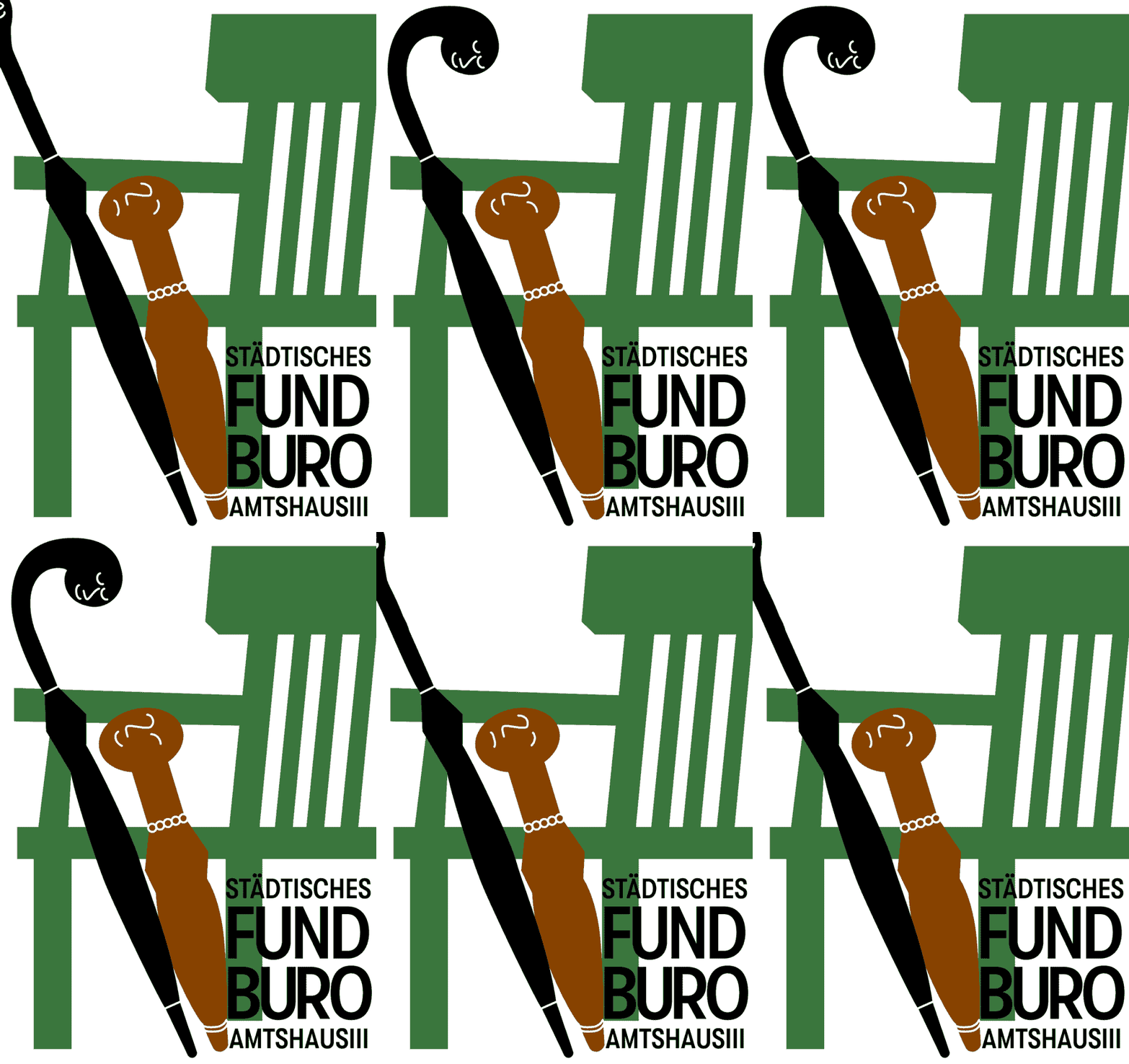
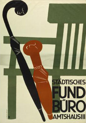




Due to its geometric construction, the regular width of GT Walsheim creates quite wide word shapes. Like the regular width, the Condensed follows the same principle of basing the lowercase circular letters on the R’s counter, but takes up much less space.
Otto Baumberger
Since Cyrillic and Latin superficially share a lot of similarities, it can be quite tempting to just re-use the Latin shapes. But we wanted to give the Cyrillic its own personality, befitting the one of its Latin brother. The К for example was designed with a slope on its top leg as a reference to the traditional design of this Cyrillic character. Similarly, the И (the Latin I) is not just a mirrored N but follows a more historical design approach. The typeface also supports Bulgarian alternates.
Довиждане
Так как кириллица и латиница имеют много общего, может возникнуть соблазн просто перевести основные формы букв из латиницы. Но мы решили дать кириллице свой собственный характер, сочетающийся с ее латинской сестрой. Буква К, например, написана с наклоном на верхнем диагональном штрихе, как полагается традиционному кирилическому шрифту. Точно так же и буква И не просто подражает латинской N, а соответствует более историческому дизайну буквы. Данный шрифт также включает альтернативные формы букв, характерные для болгарского языка.
While working on a number of customized GT Walsheim versions we noticed how useful alternate designs for Y, a, and y would be. The new typeface now contains alternates for these three characters.
Yay!
Based on Otto Baumberger’s posters, GT Walsheim also offers an alternate set of umlauts for use in German.


ZÜRICH HÖLL WÄHLT
Extending the typeface with a condensed subfamily started with the redrawing of the original width’s weights. In the course of that, the characters’ pathing and metrics were controlled and adjusted where necessary.


Special consideration was given to making the regular width work well with the Condensed subfamily. This specifically required changing some horizontal metrics to make it work better across the board. While we only offer the new version on our website, you can always request the old font files from us. The upgrade for existing customers is of course free of charge.
Have a look at most of GT Walsheim’s characters below. Download the PDF specimen for the complete character set.